Unicard App Redesign
Client
Unicard
Role
User Research
Interaction
Visual design
Prototyping
Testing
Industries
Loyalty platform
Date
August-septeber 2022
As the sole designer on the Unicard mobile app redesign project, I was responsible for researching, ideating, and creating the design. I collaborated closely with stakeholders, including the project manager, developer, and client, to ensure that everyone was aligned on the design vision. I created wireframes, mockups, and interactive prototypes to test the design with users and refine it based on feedback. I also delivered design assets to the developer, including style guides and design specifications. Despite the tight deadline of two weeks, my role was crucial in delivering a successful outcome that met the needs of the project and provided a positive user experience.
Goals of Redesigning
Increase user engagement and retention: Encourage users to spend more time using the app and exploring its features, leading to increased engagement and loyalty.
Streamline the reward redemption process: Simplify the process of earning, tracking, and redeeming rewards, making it more efficient and enjoyable for users.
Improve user experience and navigation: Make the app more intuitive and user-friendly, allowing users to find and access the features they need with ease.
Enhance visual design and consistency: Update the app's visual design to align with the brand identity and create a consistent look and feel across all screens and interactions.
Problem statement
Unicard's mobile app experienced a decline in user activity and engagement, mainly due to an abundance of information, a lack of clear goals, outdated design elements, and the absence of a coherent information architecture. This resulted in high uninstall rates, leading to fewer new users and limited user interaction with the app.
Business Opportunities
Attract new users by improving user experience and simplifying navigation
Retain existing users through enhanced user satisfaction and ease of use
Increase user engagement with an intuitive and visually appealing app design
Drive conversions and generate revenue by streamlining user experience and information architecture
Strengthen brand image with a modern and consistent app design that aligns with brand guidelines
Competitive analysis
We conducted a competitive analysis study on five companies operating in the loyalty program app industry. This study aimed to identify the strengths and weaknesses of our competitors to uncover opportunities for enhancing Unicard's offerings. Our analysis involved a thorough evaluation of their mobile apps and user experiences, providing valuable insights into industry trends. This enabled us to develop a unique app design that differentiated Unicard from its competitors, delivering a superior user experience and setting a new standard in the market.
User Research
To gain insights into the needs, preferences, and pain points of our target audience when using loyalty program apps, we conducted user research through interviews and surveys. The objective was to obtain direct feedback from users on the existing Unicard app, highlighting areas for improvement and pain points. By gathering this feedback, we were able to identify key opportunities to enhance the user experience and ensure that our design addressed users' concerns. The user research findings played a critical role in guiding our design decisions and ensuring that the final product provided a positive and satisfactory user experience.
Participants
For our study, we sought to recruit a diverse group of participants, comprising current or potential users of the Unicard loyalty program app. Our aim was to include participants from a broad range of demographics, including different age groups, genders, and technical backgrounds. Participants' levels of experience with the app varied, providing a balanced representation of users at different stages of their journey with the Unicard app.
Research questions
What challenges do users face while navigating the current app?
How do users perceive the visual design and layout of the app?
Are users able to efficiently complete their desired tasks within the app?
Is the current app accessible to users with visual impairments?
What features do users feel are missing or could be improved within the app?
KPIs
Task completion rate
Time on task
Number of clicks to complete a task
Bounce rate
User satisfaction score
Methodologies
User interviews (one-on-one, remote or in-person)
Surveys (online, sent via email or social media)
Usability testing (remote or in-person)
Some of the interview questions
Can you describe your experience using the Unicard app?
What tasks do you typically perform within the app?
Have you encountered any difficulties or frustrations while using the app? Please provide specific examples.
How do you feel about the visual design and layout of the app?
Are there any features or functionalities that you think are missing or could be improved within the app?
Some of the survey questions
On a scale of 1-5 (1 being very difficult, 5 being very easy), how easy is it to navigate the Unicard app?
On a scale of 1-5 (1 being very dissatisfied, 5 being very satisfied), how satisfied are you with the visual design of the app?
Have you encountered any issues or difficulties while using the app? If so, please describe the issue(s).
Are there any features or functionalities that you would like to see added or improved within the app?
Do you have any additional feedback or suggestions for the Unicard app?
Based on our user research, we identified several pain points experienced by Unicard app users, including:
Overwhelming information
Confusing navigation
Outdated design elements
Lack of clear goals
Inaccessible content
Irrelevant sections
Inconsistency with brand guidelines
High uninstall rates
Users reported feeling overwhelmed by the abundance of information within the app, leading to difficulties in finding what they need and causing frustration. Additionally, the app's complex and inconsistent information architecture resulted in users getting lost while navigating through different sections, creating a poor user experience. The outdated visual elements, such as images and icons, were also reported to negatively impact users' perception of the brand and its credibility.
Furthermore, users struggled to identify and accomplish their goals within the app, such as redeeming rewards or exploring available offers, due to the absence of a clear and intuitive path. Some visually impaired users also reported challenges in reading the content due to text and background contrast issues. Users may also encounter sections with minimal value or relevance, leading to confusion and detracting from their overall experience within the app.
Finally, the app's inconsistent use of colors, typography, and other design elements made it difficult for users to associate the app with Unicard's brand identity. Combined, these issues have resulted in high uninstall rates, with users uninstalling the app without completing any goals.
Personas
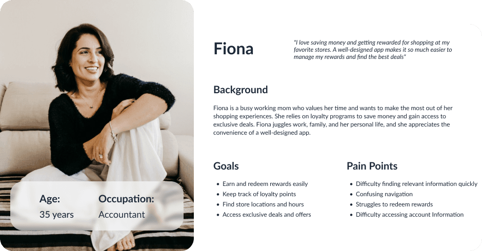
We utilized our user research findings to create several personas that represented Unicard's target audience, enabling us to design with their needs in mind. These personas helped us gain a deeper understanding of the audience's goals, pain points, and preferences, providing a clear framework for making design decisions. By focusing on designing for these personas, we created a user-centered design that addressed the unique needs of Unicard's target audience and delivered a positive user experience.
Empathy Map
Style guide
Design system
Our project included the creation of a comprehensive design system that was utilized throughout the project. This design system includes a library of reusable components, typography, color palettes, and iconography that ensured consistency and efficiency in our UI development. By leveraging this design system, we were able to save time and maintain a cohesive visual language across all screens and interactions. Our design system also helped us to ensure accessibility and usability standards were met throughout the design process. Overall, our design system played a key role in the project's success and will be valuable for future projects as well
Color Palette
The color palette is a critical aspect of our design, providing both aesthetic appeal and functionality. Our palette consists of a range of colors, each featuring a main hue with ten additional variations, all labeled with their name and contrast. The different colors are used for various purposes, including visual hierarchy and drawing attention to important elements, ensuring consistency and accessibility throughout the design.
We recognize the importance of meeting accessibility standards, including the WCAG 2 guidelines, to ensure that all users can access and use our digital assets. Our primary green color, Unicard Green, plays a vital role in our brand identity. However, we found that the original color lacked sufficient contrast, which caused difficulties in meeting accessibility standards, particularly for text and background elements.
To address these issues, we modified the original Unicard Green color from #96c11f to #86CB3C. The modified color provides better legibility, ensuring that our digital assets meet WCAG 2 guidelines for color contrast. Additionally, the new color supports our brand identity and provides a modern look for our digital assets. Overall, our color palette is designed to enhance the aesthetic appeal and functionality of our design while prioritizing accessibility for all users.
Typography
The Unicard Web has been redesigned using two different font families, "Helvetica" and "FiraGO", for both Georgian and English languages. The design style has been consistently applied to every line of text. Here are some of the styles used in the design, along with their respective font sizes and line heights.
Iconography
To maintain a cohesive Unicard web redesign, we carefully selected handcrafted icons from a library of over 2,000 with consistent style and patterns. Using these icons enhances aesthetics and user experience, promoting a recognizable brand identity. It's crucial to use icons from this library and ensure future additions are sourced from it to preserve visual integrity and prevent design inconsistencies. Consistency in design and user experience is vital for building a memorable brand identity.
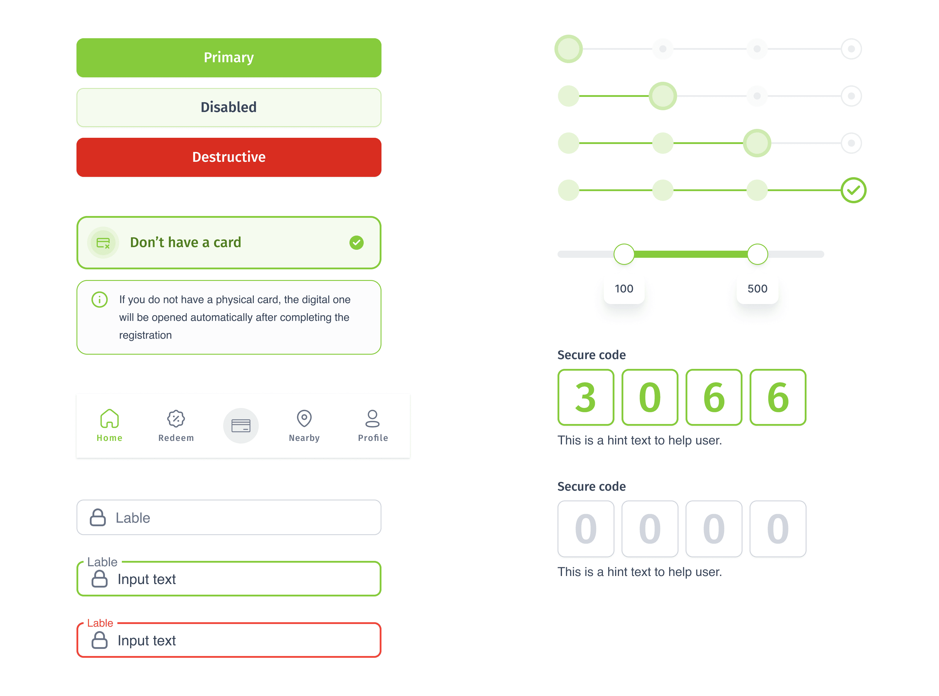
Design system components
Here are some key components from our design system that were utilized in the project. These components ensured consistency and efficiency in our UI development while maintaining a cohesive visual language.
Bellow you can see some of the components of the design system
Takeaways and future updates
The redesigned Unicard app aimed to improve the user experience and address the main pain points identified through user research. The redesign process included several design improvements, such as a cleaner and more modern layout, improved navigation, and a simplified redemption process. The redesign also incorporated several accessibility features, which received positive feedback from users. The usability study findings showed that the majority of users reported increased satisfaction with the redesigned app, indicating that the user experience has improved.
Here are the key metrics we tracked before and after the app redesign:
Disclaimer* - Please note that due to the terms of our Non-Disclosure Agreement (NDA), we cannot disclose the actual web page analytics data for this case study. To protect the confidentiality of the data, we have replaced the actual metrics and statistics with random numbers. The metrics and statistics mentioned in this case study are for illustrative purposes only and do not represent actual data. Any resemblance to actual data is purely coincidental
Back to home page


