Chapter • 01
The Foundation
Simplifying a multi-rail financial ecosystem into a single, fluid interface
My Role
Product Design Lead
Timeline
3 Years (From 0 to Launch)
Core
Banking App & Design System
Platform
iOS, Android & Web
The Challenge
We were building a neobank from scratch in a market dominated by a rigid banking duopoly. The existing "market standard" forced users to navigate a complex web of multiple accounts, technical sub-accounts, and cluttered interfaces. Our challenge was to disrupt this ingrained mental model without alienating users who were accustomed to the chaos
The Goal
To build "Modern Banking for Modern Lives". We aimed to shift the user relationship with money from anxiety to confidence. This required a radical simplification of the account architecture - moving from the industry-standard "Multi-Account" model to a "Single-Hub" ecosystem, ensuring that clarity and transparency were embedded into every interaction, not just the marketing

BEHAVIOR OVER PREFERENCE
We had a qualitative research sprint with 14 ideal customer profiles to understand why they juggled multiple accounts. The majority (around 80%) was actively using a single account.
After digging into use cases of multiple accounts, the data revealed two distinct 'Jobs to be Done'
The Burner Wallet: Users opened secondary accounts to isolate funds for online shopping, protecting their main balance from sketchy merchants.
The Commitment Phobia: Users parked savings in standard current accounts (earning 0%) simply to avoid the rigid lock-in penalties of competitor deposits. They prioritised liquidity over yield

SOLVING THE PROBLEM, NOT THE SYMPTOM
Instead of building a complex multi-account system just to support "burner" behaviors, we decided to build specific tools that solved the actual user needs directly
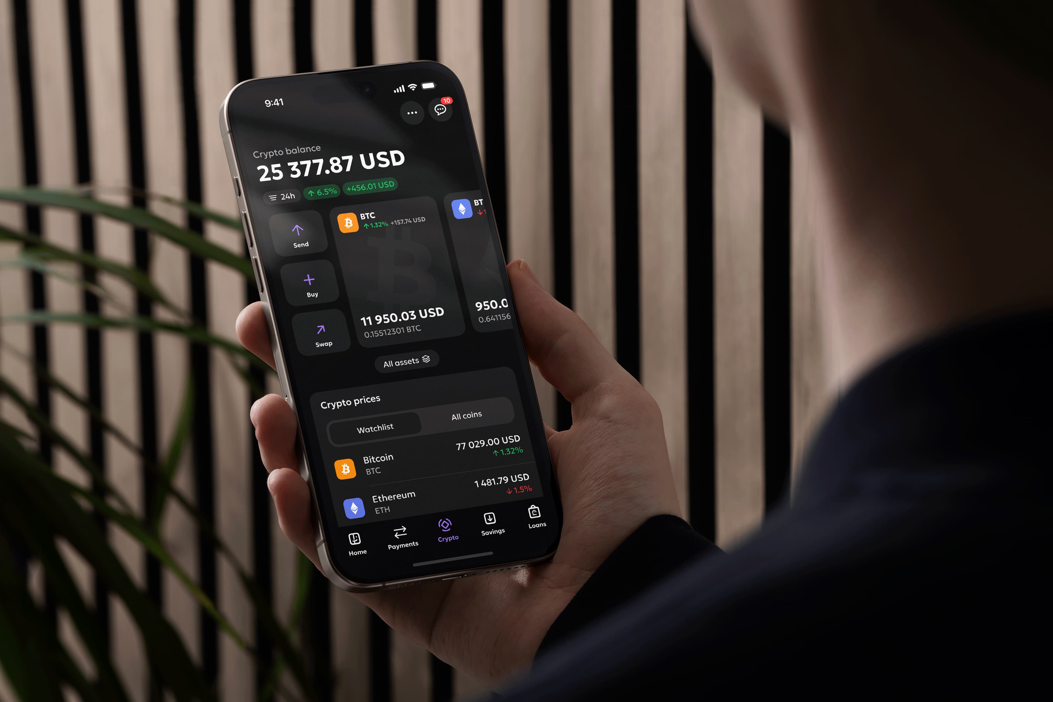
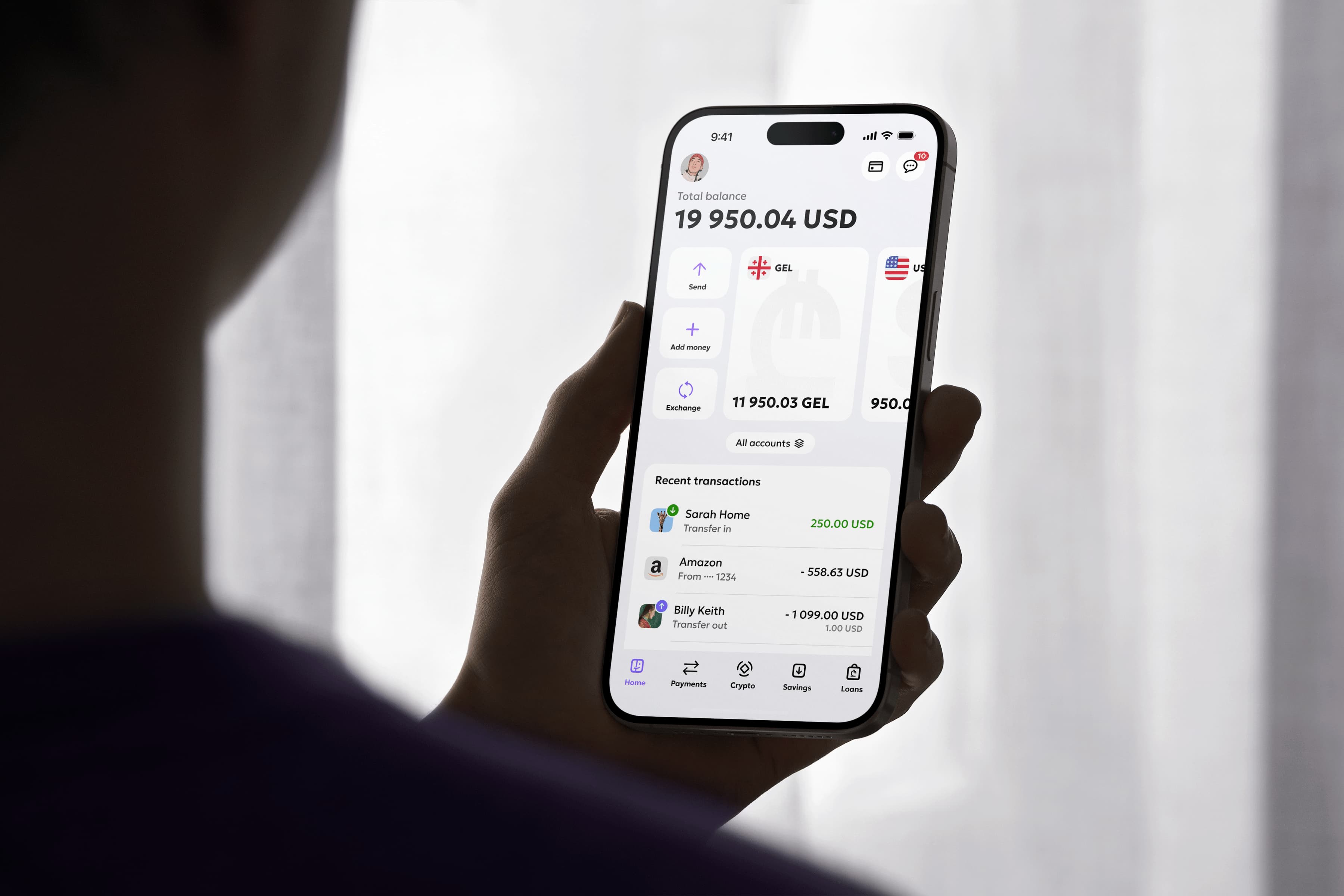
I proposed a Single-Use Digital Cards, they auto-destruct after one transaction, solving the 'Burner' need without the friction of a new account
Paired with 'Liquid Saving' - We redefined the 'Deposit.' The model that eliminates the fear of lock-in. It allows instant withdrawals without forfeiting accumulated interest, and includes a 'Restock' logic where returned funds resume earning immediately. It offers the flexibility of a checking account with the benefits of a deposit

The Outcome | Validation
Local Users: Initially hesitant, but they converted quickly once they realised they didn't need to manually transfer money between accounts anymore
Global Users: Validated instantly. Users familiar with apps like Wise recognised the pattern, confirming we were ready for international markets

THE CHALLENGE
Global money movement is quite fragmented. We have to deal with competing "rails" (SWIFT, SEPA, XBS, Local), where every single network requires different data fields and has different processing speeds.
Most apps go with the easy solution asking users to to "Choose a Network" in the first few steps. This leads to decision paralysis, confusion, and frequent "invalid format" errors
THE SOLUTION
Instead of exposing this complexity, I designed a Unified Send Flow
1
Dynamic Interface: The form automatically adapts based on the destination. It only asks for the specific data fields required for that country, hiding everything else
2
Smart Routing: The backend acts as a traffic controller, automatically selecting the fastest and cheapest settlement path. The user never has to worry about the rest
THE LOGIC
Most banking apps ask users to pick a channel (like "SWIFT") first. We reversed this. We ask for the Destination (Country) first
This acts as a master filter. By setting the location immediately, the system hides any options that don't work for that country. The user never sees a button they can't click
THE EXPERIANCE
Once the context is set, the system automatically picks the best route based on speed and cost. This removes "decision paralysis" for the user

THE BUSINESS WIN
I introduced a tie-breaker rule. If two options have the same speed and cost for the user, the system defaults to the route that is more profitable for the bank. This aligns user experience with business goals effortlessly
THE HIDDEN EFFICIENCY
While the UI looks casual, the backend is smart. When a user starts a chat, the system silently tells the agent exactly which screen the user is on and their last transaction status. The agent has immediate context without asking
NEXT CHAPTER